Dividend re-investment
Dividend reinvestment allows investors to automatically reinvest dividend payouts into additional shares rather than withdrawing them as cash. The existing experience was difficult to understand and created friction during account management.
The goal was to simplify the dividend reinvestment journey and help investors clearly understand the impact of their decisions.
Role : Senior UX Designer
Timeline: 7 months
Team: Product analyst, UX researcher, Mid-UX designer, API, QA and Tech
Company: Interactive Investor
Tools: Figma, Jira, Loop
Impact: Re-platformed the journey, which led to a decrease in customer complaints by 32% compared to last year


Background
The problem
At Interactive Investor, I led the redesign of the Dividend Reinvestment feature across web and mobile. This feature enables users to automatically reinvest dividends to compound returns a key behaviour for long-term investors .
The existing experience was built on legacy infrastructure, creating inconsistencies, usability issues, and limitations for future scalability.
The dividend reinvestment experience was underperforming due to:
Fragmented workflows across web and mobile
Poor discoverability within the platform
Lack of clarity for new investors making financial decisions
Inconsistent UI patterns due to legacy systems
This resulted in:
User confusion
Increased reliance on customer support
Reduced confidence in enabling reinvestment
My role
Led end-to-end product design
Defined problem space with product and research
Facilitated cross-functional collaboration (PM, engineers, QA, API teams)
Drove design decisions and trade-offs
Success metrics
These are the success metrics and criteria set for the project to make sure all ares were considered
User goals
Business goals
Constraints
Redesign the experience to:
Improve usability and decision confidence
Create a consistent cross-platform system
Reduce friction in enabling/disabling reinvestment
Align the feature with the new design system for scalability
Understand how reinvestment works
Clearly see eligible holdings
Make quick changes to reinvestment preferences
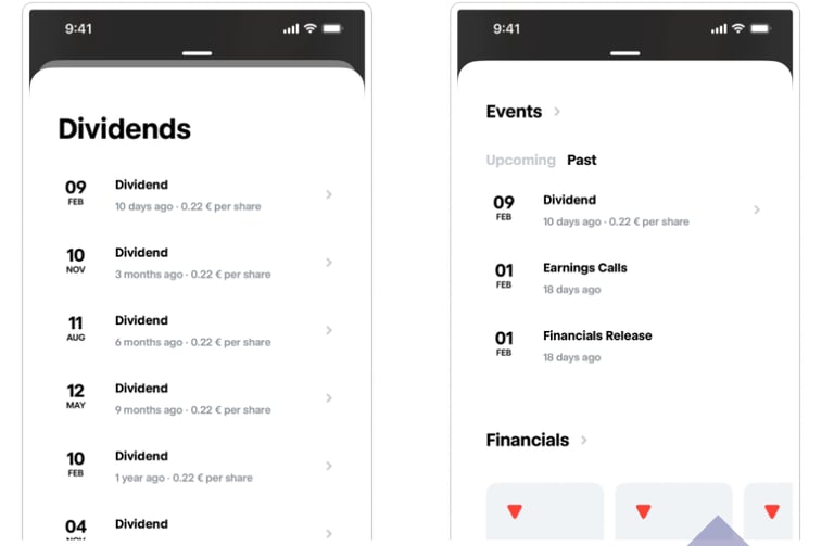
The ability to view their dividends
Project scope limited to enable/disable reinvestment only
Legacy backend (WebBroker) imposed technical constraints
Additional features (e.g. investment dashboards) were out of scope
Needed to align with evolving design system
Research & discovery
Research approach
Moderated usability testing (5 active investors)
Behavioural insights from CX team
Heuristic evaluation
Competitor analysis
Key insights
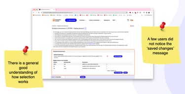
Users understood the concept but lacked confidence in execution
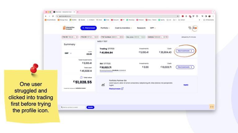
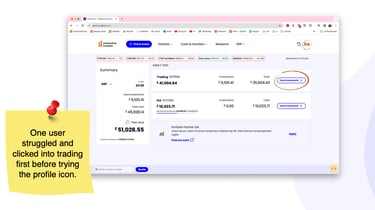
Navigation was unintuitive (misplaced in mental model)
Missing contextual information created hesitation
Feedback signals (e.g. confirmation states) were too weak

How might we...
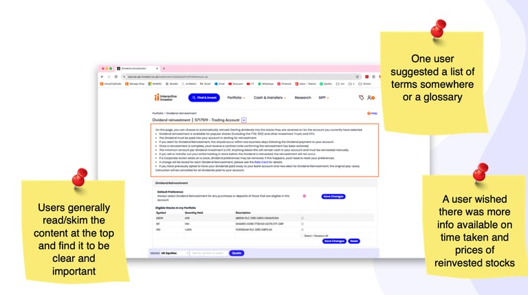
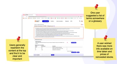
…provide more clarity on dividend reinvestment eligibility?
…provide multiple routes to the page for easier navigation?
…provide clearer feedback that settings have been changed?
...provide a simpler process to reinvest dividends for bot seasoned and new users?
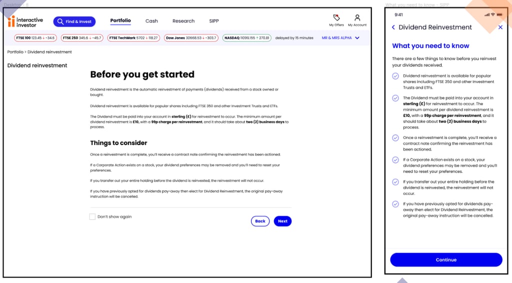
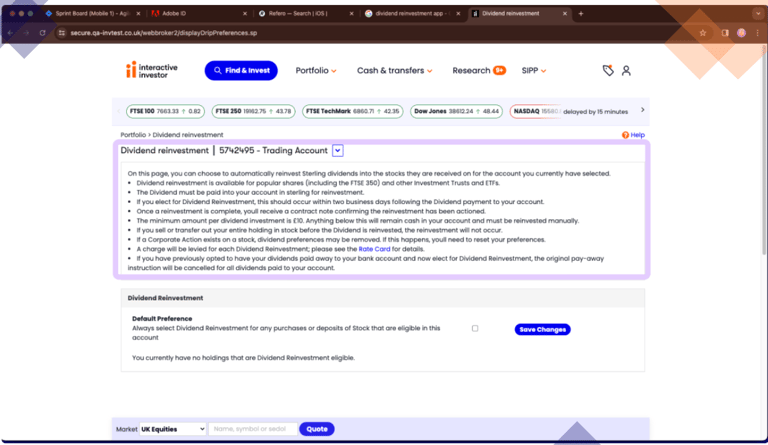
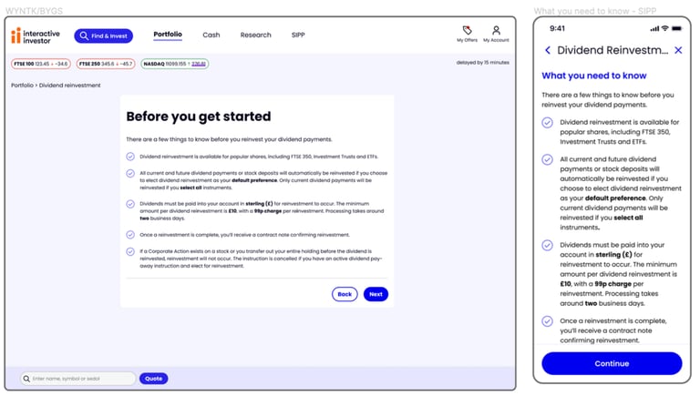
...breakdown the 'block of text' to be understood, so all users are aware of what dividend reinvestment is, and the fees included
Workflow assessment
A few competitors were analysed to understand how the mobile app concept was designed in the industry
Heuristic evaluation
Competitor analysis
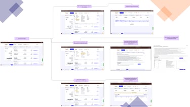
The journey went through evaluation to ideate a clearer structure for dividend actions.
Concept exploration
Several interaction and navigation patterns were explored.
Key improvements included:
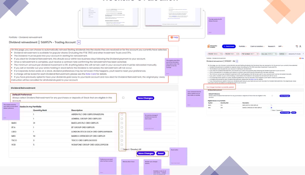
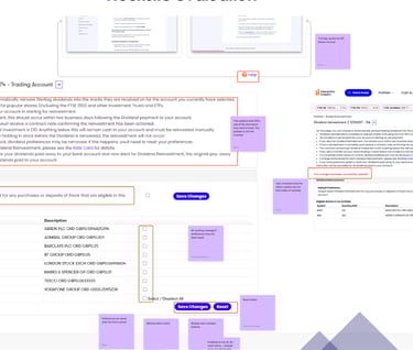
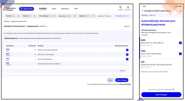
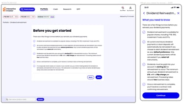
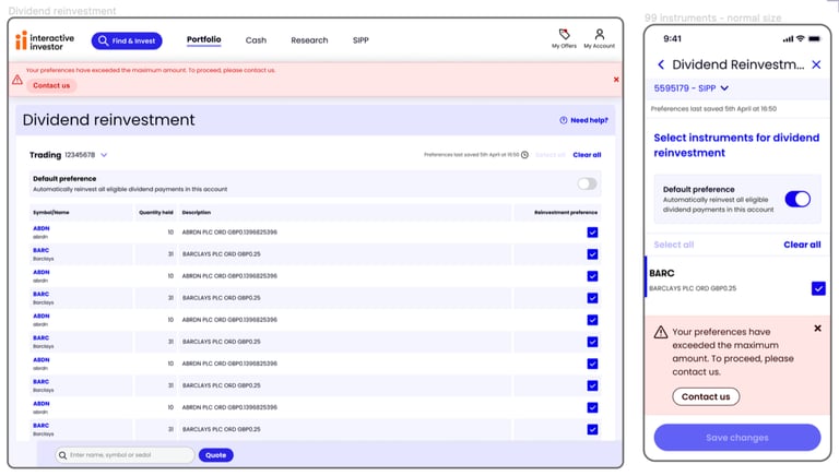
Visible feedback notifications when reinvestment settings are changed
clearer eligibility indicators for holdings
contextual explanations explaining how reinvestment works
The goal was to reduce cognitive load and align the interface with investors’ mental models.
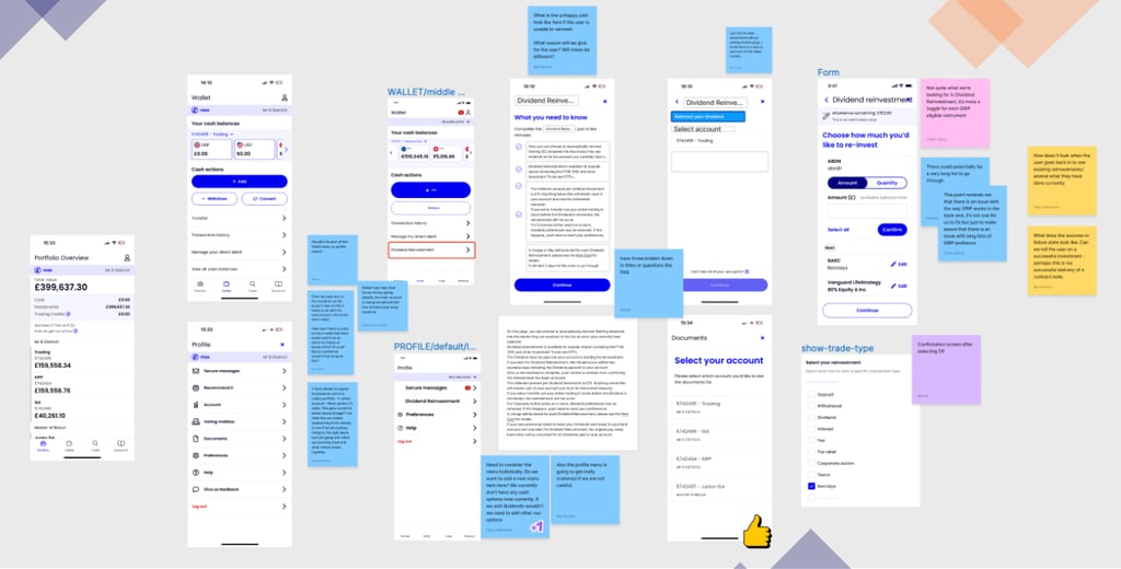


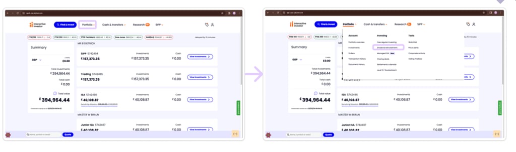
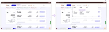
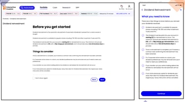
For the website there were quite a few more starting points such as the transaction history, order list or straight under the portfolio. Then all the information would be either be visible o one page or an information page will be shown before that.
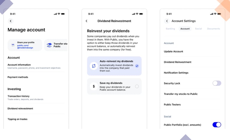
Mobile app
Web
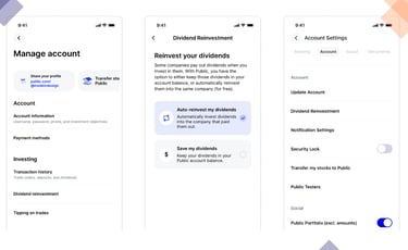
For the mobile concept, because this will be a new app feature we had to start from scratch. There were a two starting points that were explored, such as the profile menu or in the wallet. Beyond that we needed a page to explain what dividend reinvestment was and the eligibility criteria, before landing on the actual page to change the settings.
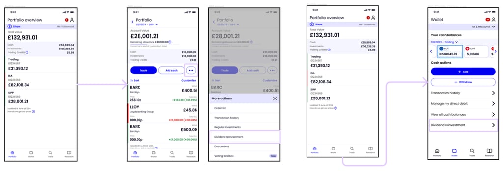

These initial wireframes went through consumer duty testing.
Key findings:
The 'default' feature in the journey, was not clear
Users found it hard to switch accounts
Good consumer understanding of eligibility and fees
The navigation was still not clear

Final design

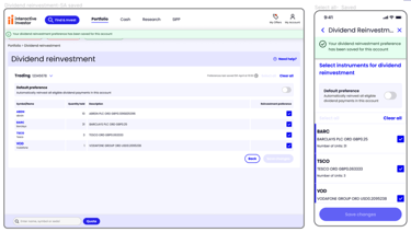
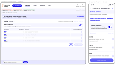
Reduce cognitive load in financial decision-making
Added contextual guidance (tooltips, explanations)
Separated complex information into digestible steps
Decision:
Prioritised clarity over density of information
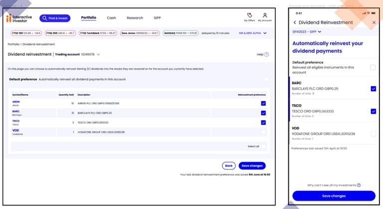
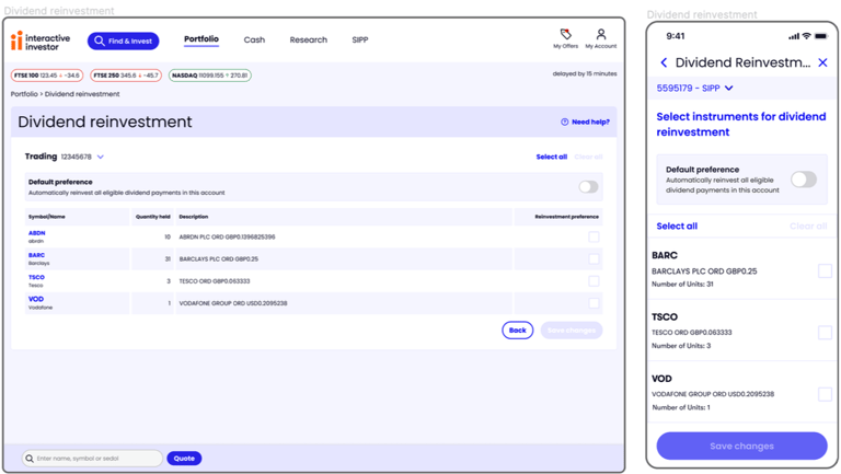
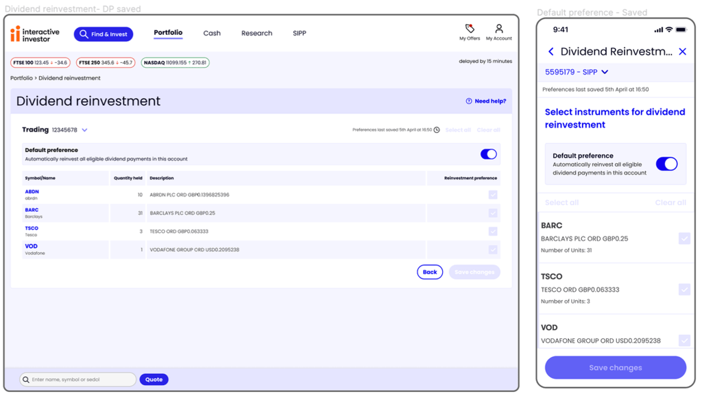
Before
After
Improve discoverability through product placement
Instead of treating reinvestment as a hidden setting:
Introduced clearer entry points
Surfaced status within portfolio view
Trade-off:
Increased visibility vs UI clutter
Chose visibility due to impact on adoption
Key product decisions
Standardise cross-platform behaviour
Unified web and mobile interaction patterns
Designed mobile-first components for scalability
Impact:
Reduced friction for multi-device users
Created reusable system patterns
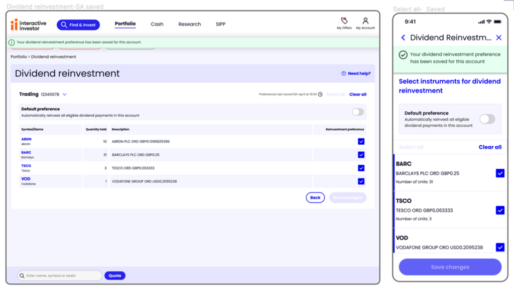
Strengthen system feedback
Improved confirmation states
Increased visibility of system status
Why:
Financial actions require high trust and reassurance
Design system contribution
Collaboration with Engineering
Implemented updated components across feature
Introduced new patterns for:
Financial settings flows
Confirmation feedback
Ensured scalability for future features
Worked closely with engineers to align on:
API constraints
Data handling
Feasible interaction patterns
Adjusted designs based on:
Backend limitations
Performance considerations
Results & impact
SUS score: 84 (above industry benchmark)
Improved clarity and confidence in task completion
Reduced user confusion in navigation and feature understanding
Established scalable patterns for future financial features
Next steps
Measure adoption rate of reinvestment post-launch
Track behavioural metrics (conversion, retention)
Explore dashboard-level visibility for investment performance
Continue iterating on onboarding for new investors