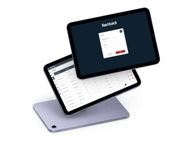
Vantage pricing portal
The Rentokil Pricing Portal is a powerful tool designed to streamline operations and improve accessibility to pricing information for Rentokil, a global leader in pest control and hygiene services.
Role: UX/UI Designer
Timeline: 4 months
Company: Rentokil Initial
Tools: Figma, Canva, Jira, Miro
Impact: Improved customer satisfaction ratings from 3.2 to 4.6/5

My role
My role as the lead designer on the project involved addressing critical challenges through a design-centred approach. By focusing on user research, responsive design, centralised data, and role-based access, I transformed the Vantage pricing portal into an efficient, user-friendly, and scalable tool, driving enhanced operational efficiency and customer satisfaction. I'm excited to share this case study that showcases how our user centred design approach has transformed Rentokil's pricing processes, resulting in a more agile and customer-focused organisation.
Background
The problem
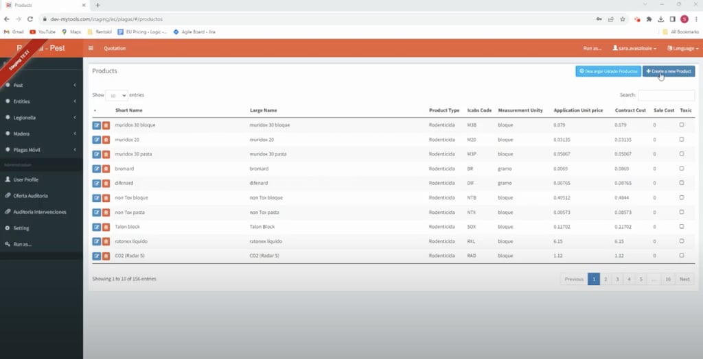
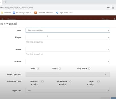
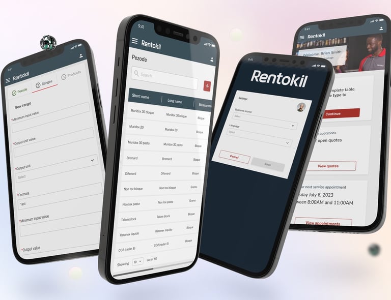
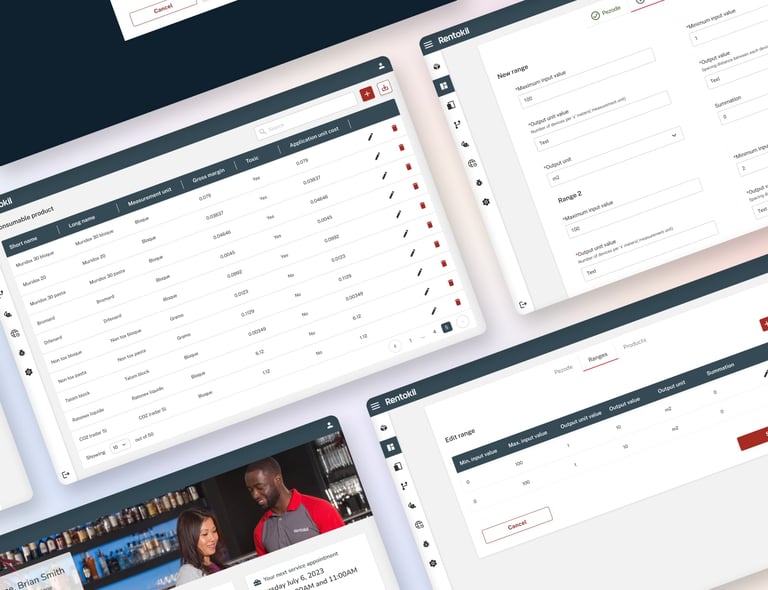
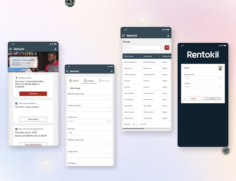
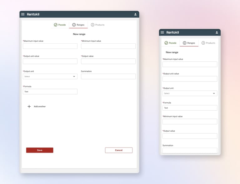
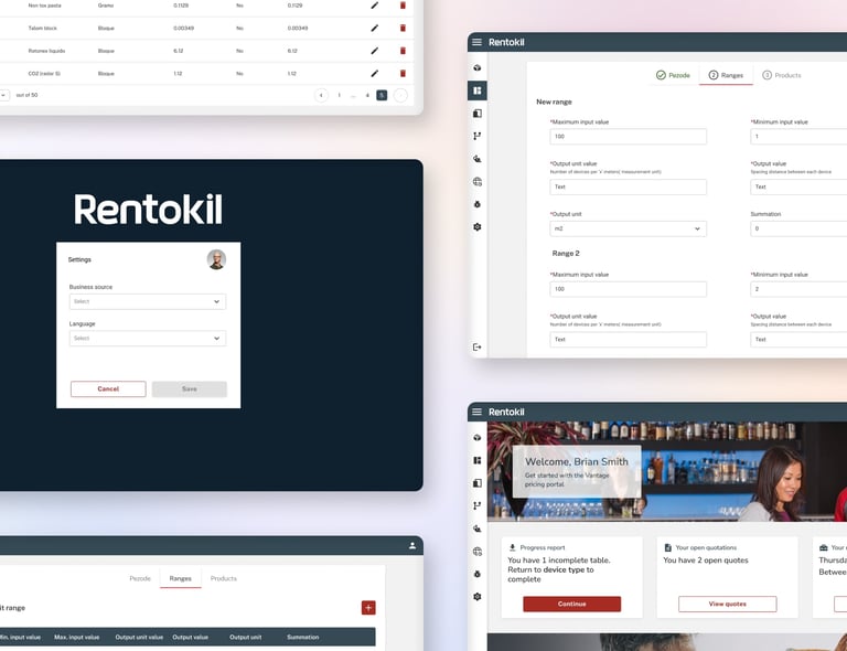
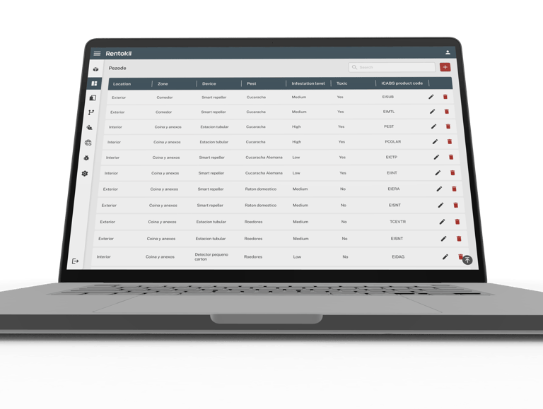
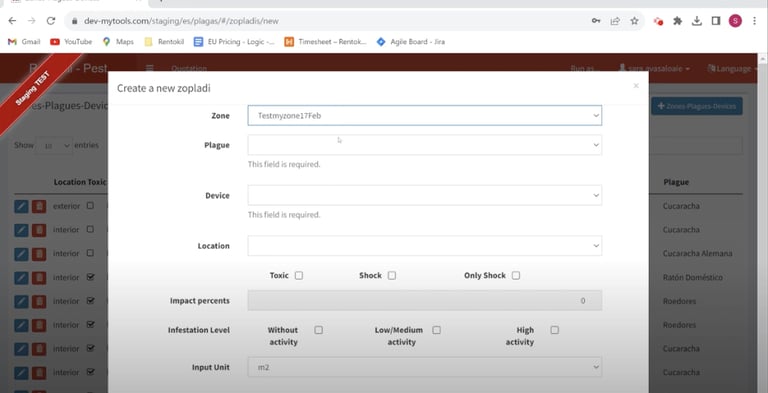
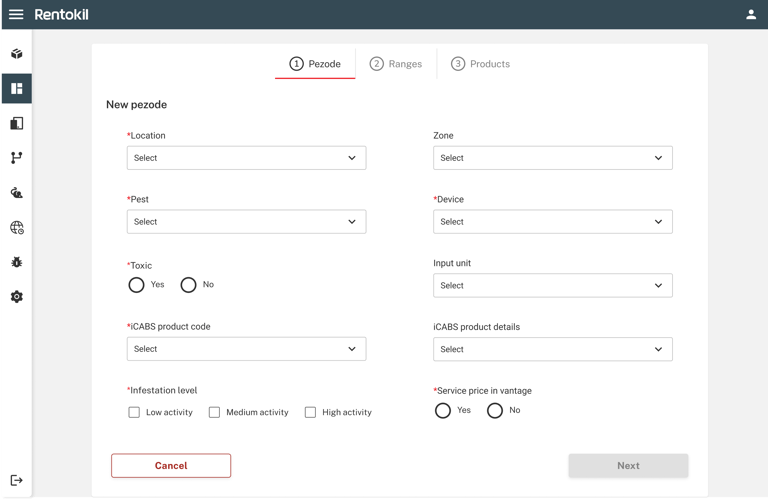
The portal's primary functions included quote management, pricing record storage, and an information gateway. It needed to centralize data, accommodate various user roles, offer advanced search capabilities, and deliver responsive design across devices.
Fragmented Data
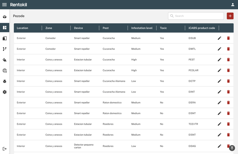
The old portal had data scattered across multiple systems. We needed to unify and centralise it. Solution: Created a robust database system that integrated all pricing data, providing a single source of truth.
Outdated UI/UX
The portal's outdated design hindered usability and efficiency. In order to curb this we conducted extensive user research, redesigned the interface with a focus on user-centric design principles, and implemented a responsive, intuitive UI.
Limited Accessibility
Users struggled with accessing data while on the go. We implemented responsive design, ensuring seamless access from desktops, tablets, and smartphones.
Success metrics
These are the success metrics and criteria set for the project to make sure all ares were considered
User goals
Business goals
Constraints
Increase transparency in pricing
Reduce customer confusion
Support conversion to appropriate plans
Quickly understand platform costs
Compare pricing tiers
Make informed decisions
Pricing logic tied to complex operational rules
Legacy systems storing fragmented pricing data
Limited timeline due to operational rollout deadlines
Research & discovery
Customer feedback and surveys indicated that users often misunderstood how charges were applied.
Pricing information was spread across multiple pages and lacked clear comparisons.
Users wanted:
Clearer breakdowns of fees
Visual comparisons between plans
Real examples of cost scenarios
Workflow redesign
The portal was redesigned to present pricing information more clearly.
Key improvements suggested:
structured pricing comparisons
simplified explanations of fees
clearer hierarchy of information
The design aimed to reduce cognitive load while ensuring regulatory transparency.
Current designs
Different approaches were explored to present pricing clearly.
Options included:
static pricing tables
interactive cost calculators
tier comparison cards
The final solution combined comparison tables with contextual explanations.
Final design
The final design focused on clarity and trust.
Features included:
Customised user access
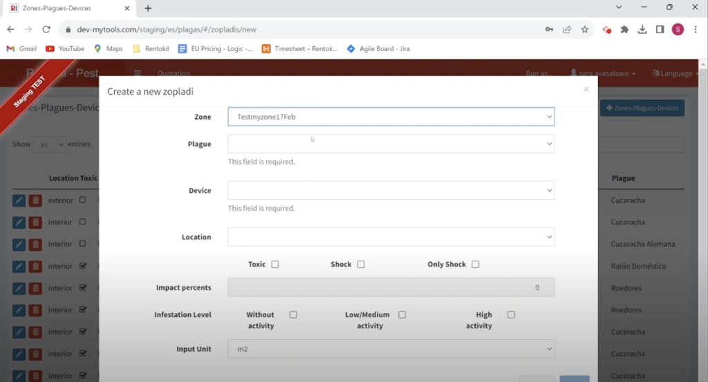
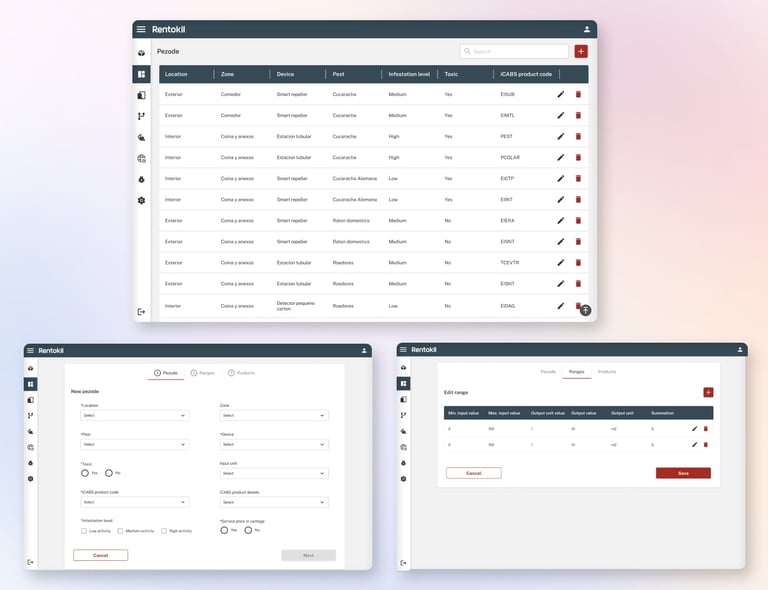
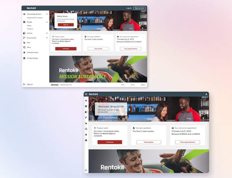
The portal is designed to accommodate various user roles, providing tailored access to information. Sales representatives, managers, and administrators have access levels that match their responsibilities, ensuring data security and user-specific experiences.Comprehensive pricing records
With a robust database, the portal maintains a comprehensive history of pricing records. This historical data allows Rentokil to make data-driven decisions, track pricing trends, and optimise pricing strategies for different markets and services.Responsive design
The portal offers a seamless experience across devices, including desktops, tablets, and smartphones. This responsive design ensures that Rentokil's team can access critical information while on the go.


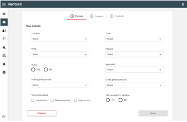
Before
After

Results & impact
The improved pricing experience helped users understand the platform’s cost structure more easily.
Expected outcomes included:
Improved user confidence
Better form selection
Fewer pricing-related support queries
My learnings
Complex operational systems require clear information architecture to remain usable.
Future improvements could include:
Advanced search and filtering capabilities
Pricing calculators and illustrations
Deeper integration with operational systems
Customisable tables